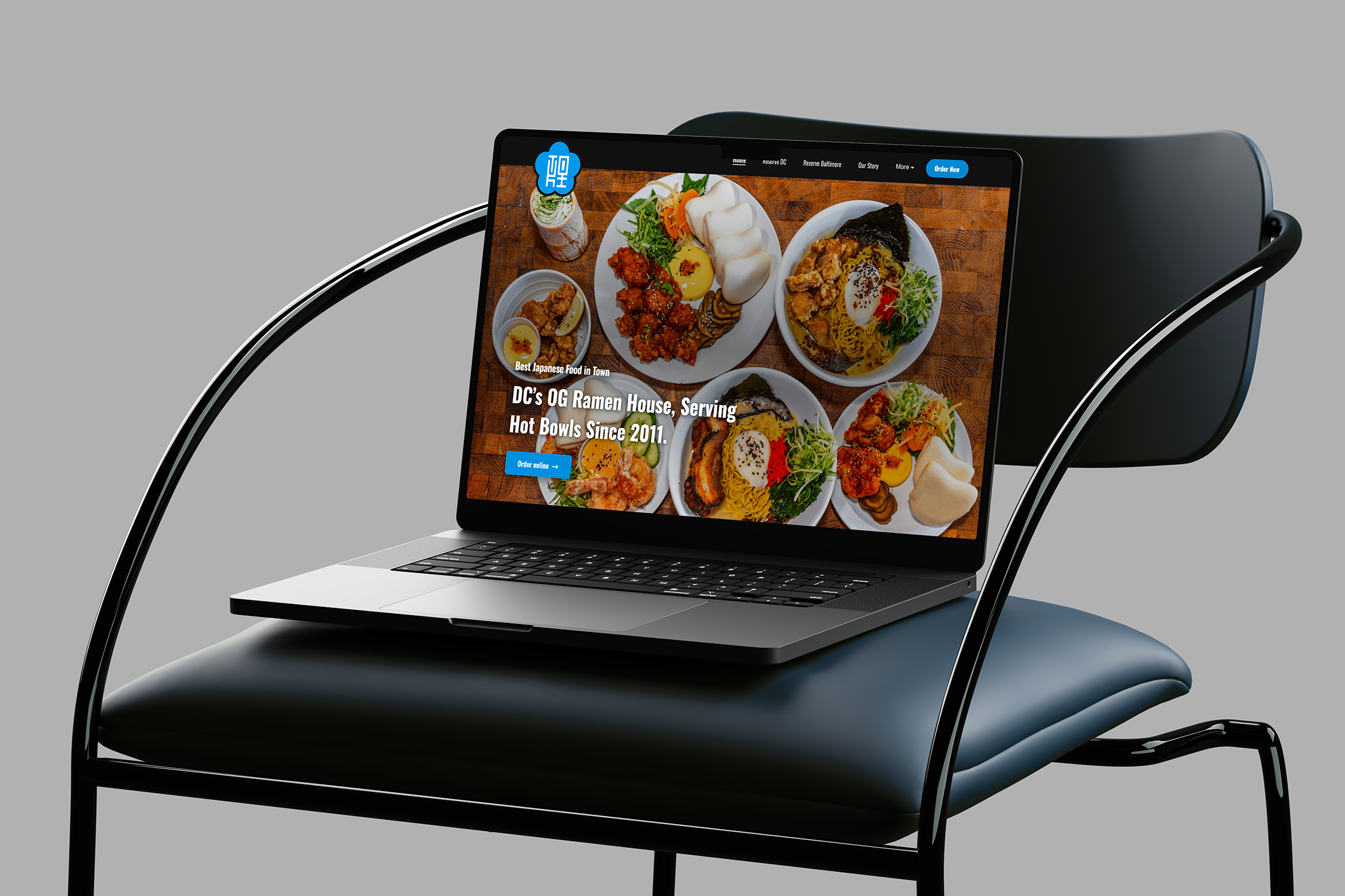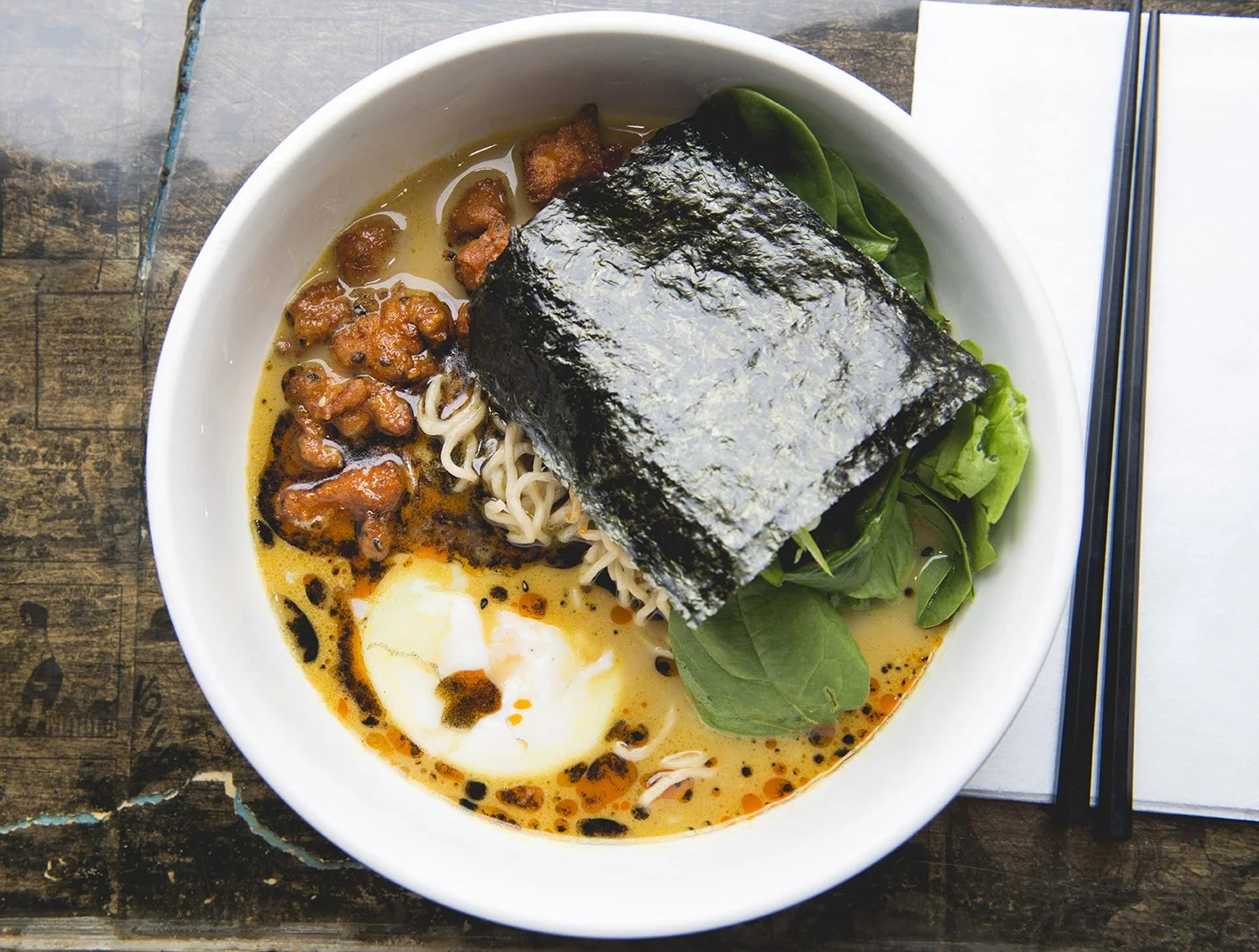

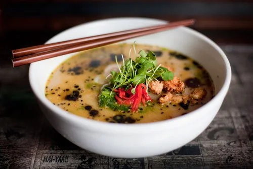
What started as a dream to open Washington, DC’s first ramen restaurant has grown from a hidden 23-seat attic space into a beloved DC institution. Tucked above a friend’s neighborhood bar, Toki Underground quickly became an underground destination for authentic ramen. More than fifteen years later, the restaurant continues to thrive and has expanded to a second location in Baltimore.
This project represents the most complete expression of my creative work. With full creative ownership of the brand, I developed the identity, visual language, and experience from the ground up. Fifteen years later, it remains the project I am most proud of and the one that best reflects my approach to design, storytelling, and brand building.

From the beginning, we wanted Toki to feel hidden, unexpected and exclusive for those in-the-know. We even decided not to put a sign on the door for a few years. The journey became part of the experience, creating the feeling that you had discovered a secret spot.
That sense of mystery helped define the brand and gave meaning to the name. What started as a hidden ramen shop eventually earned national attention, including an episode on Food Network’s Diners, Drive-Ins and Dives with Guy Fieri in 2015.


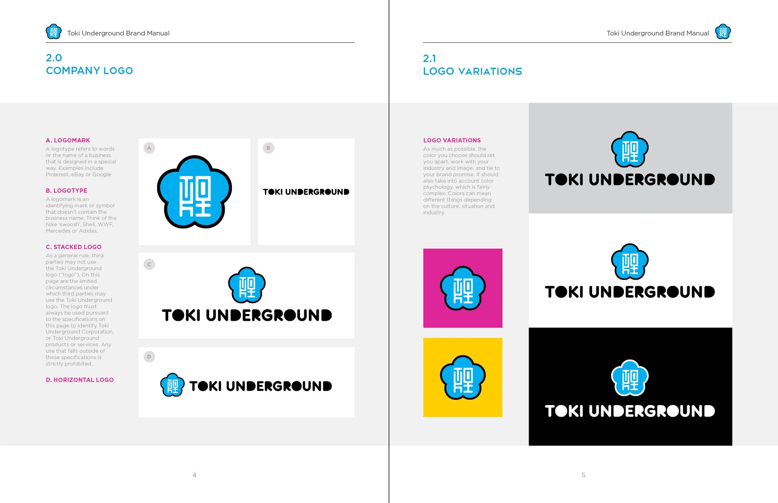
LOGO
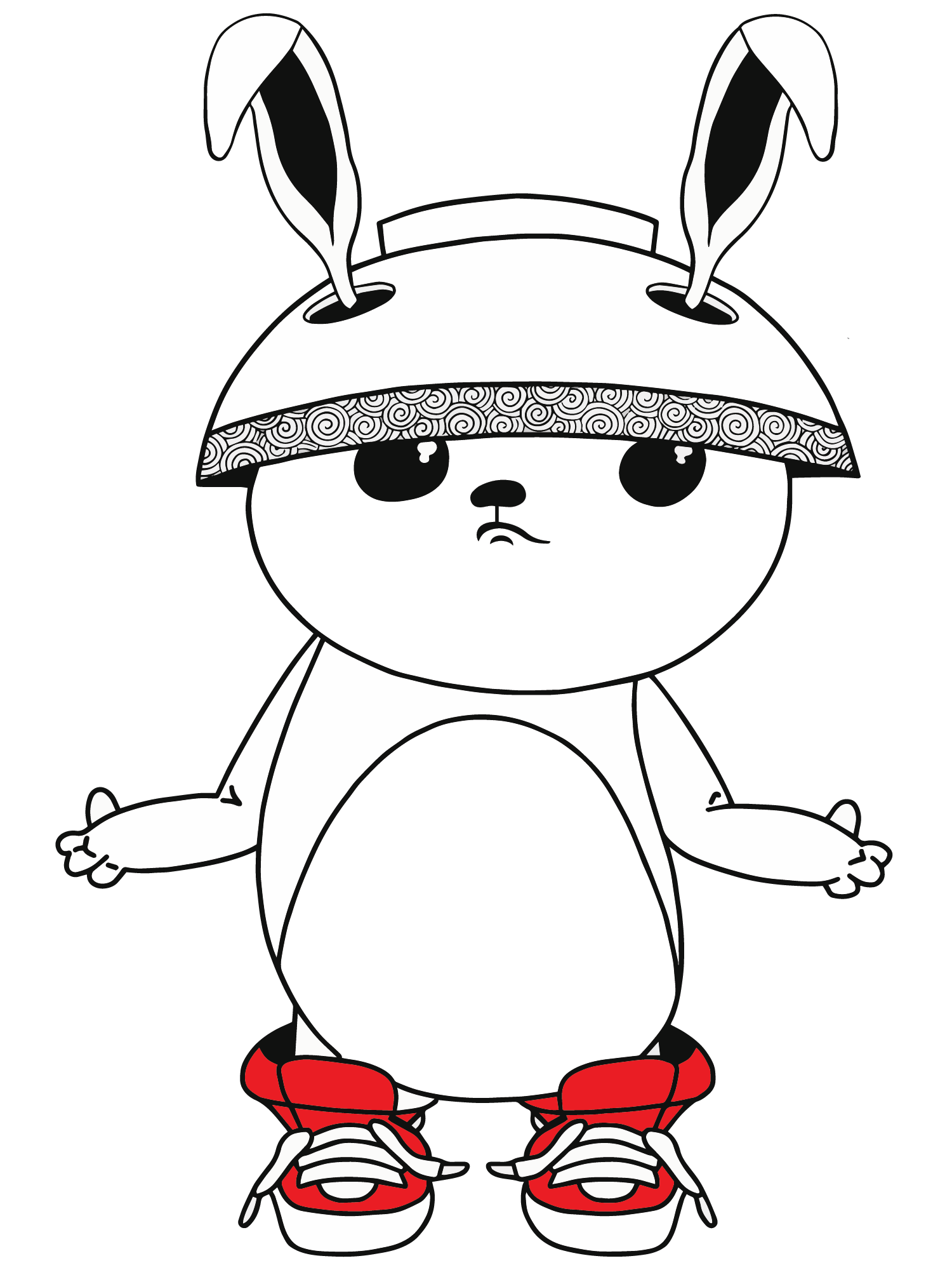
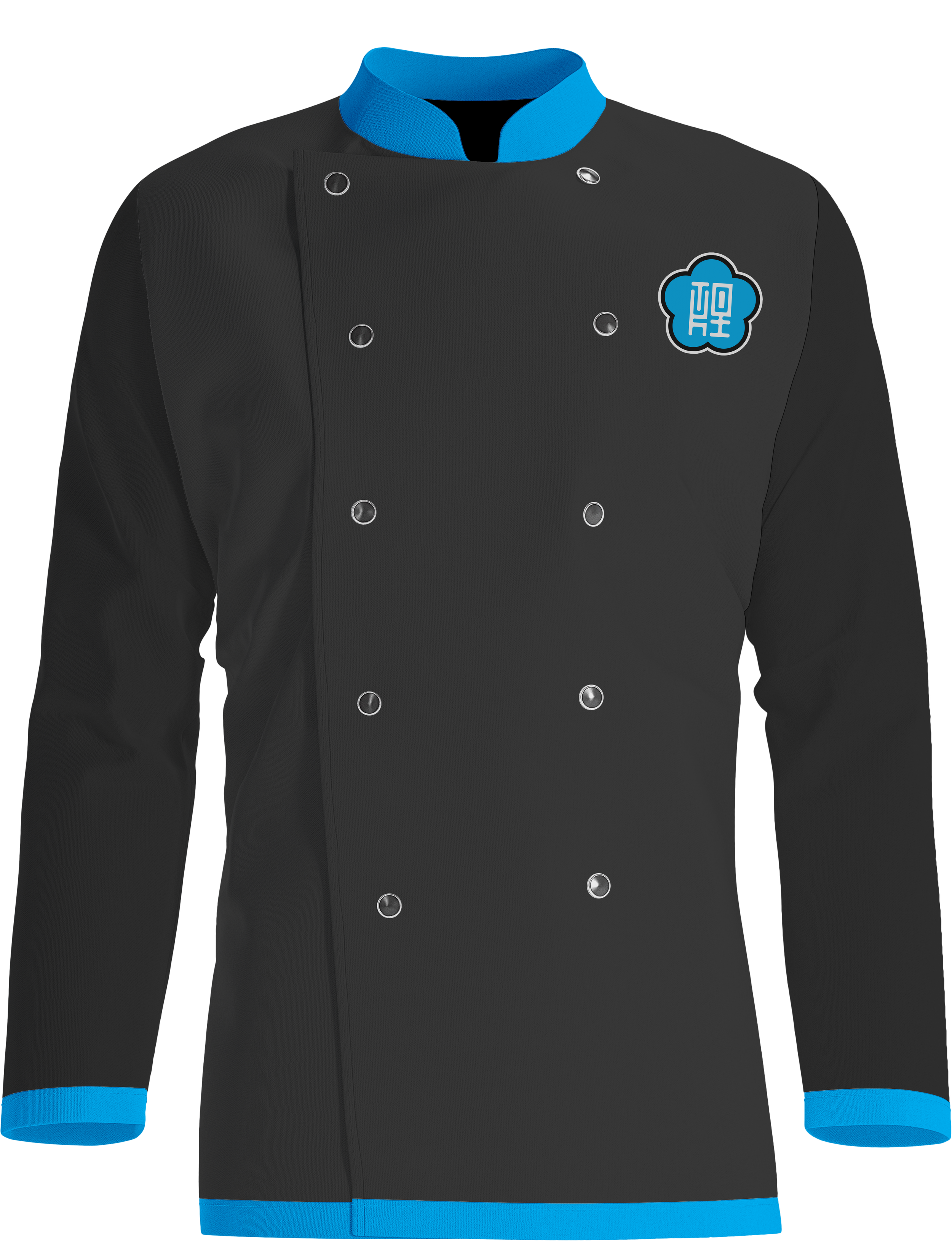
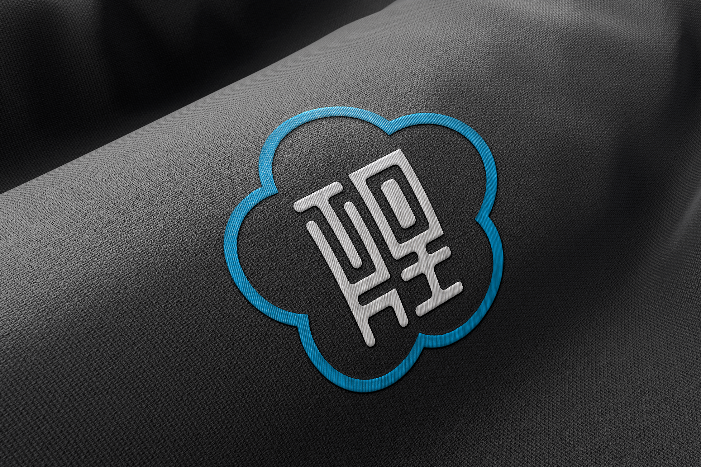
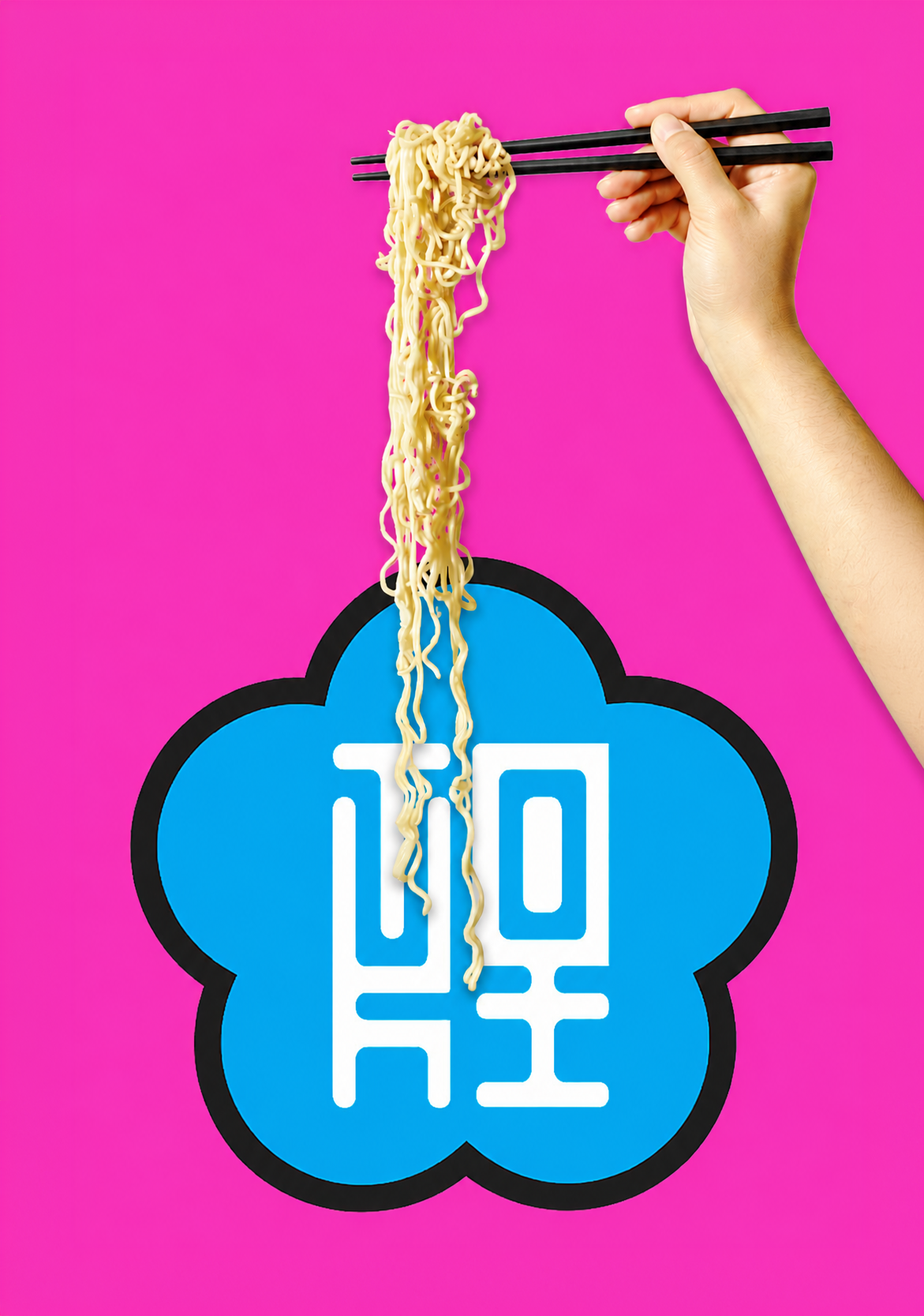
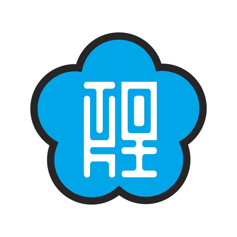
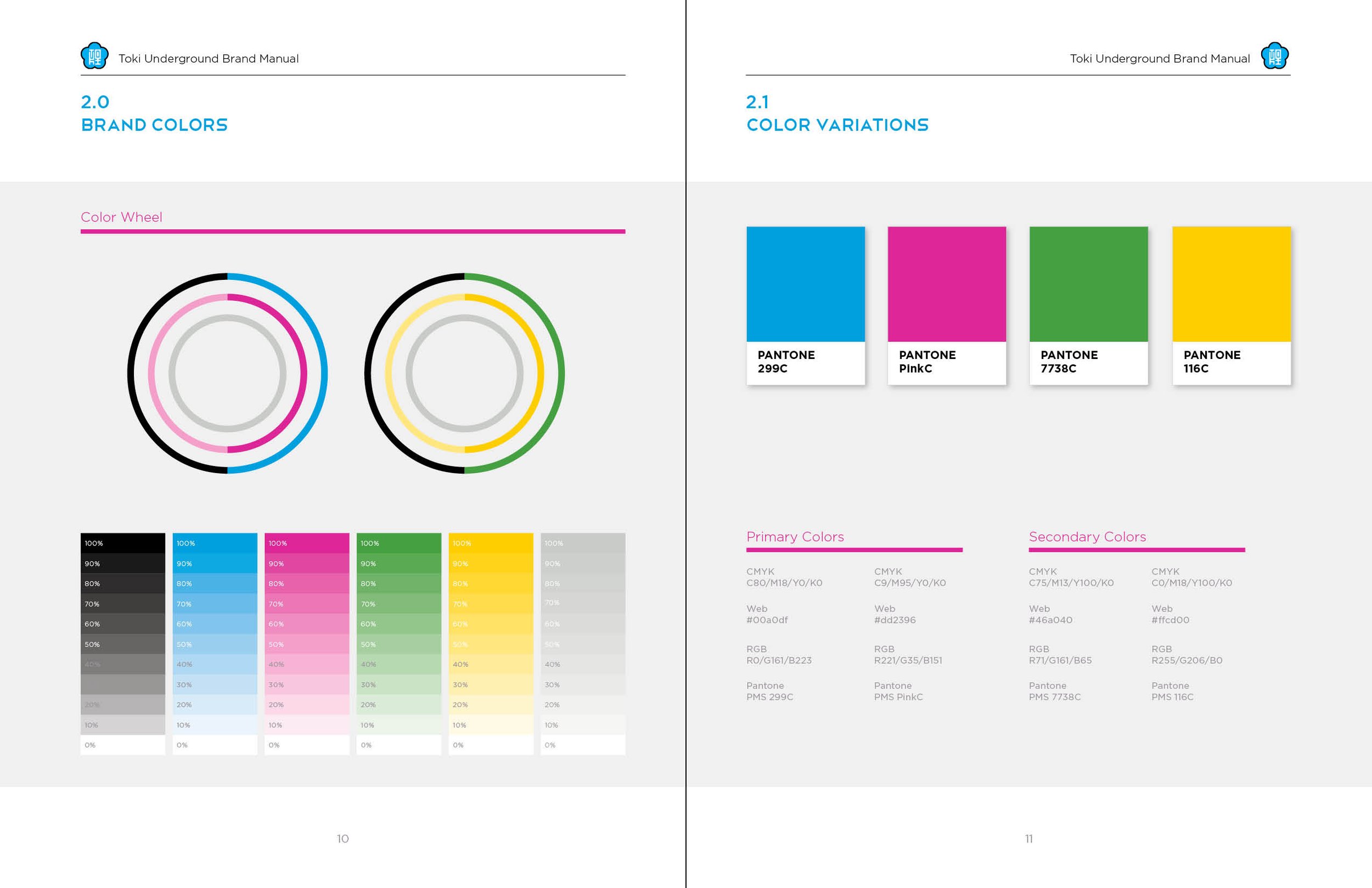
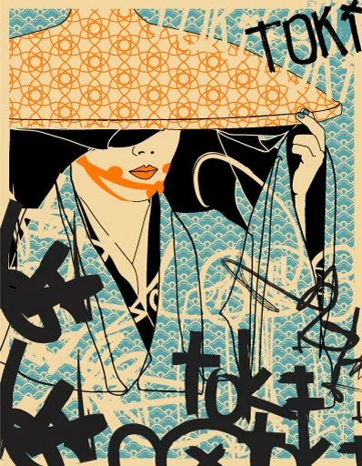
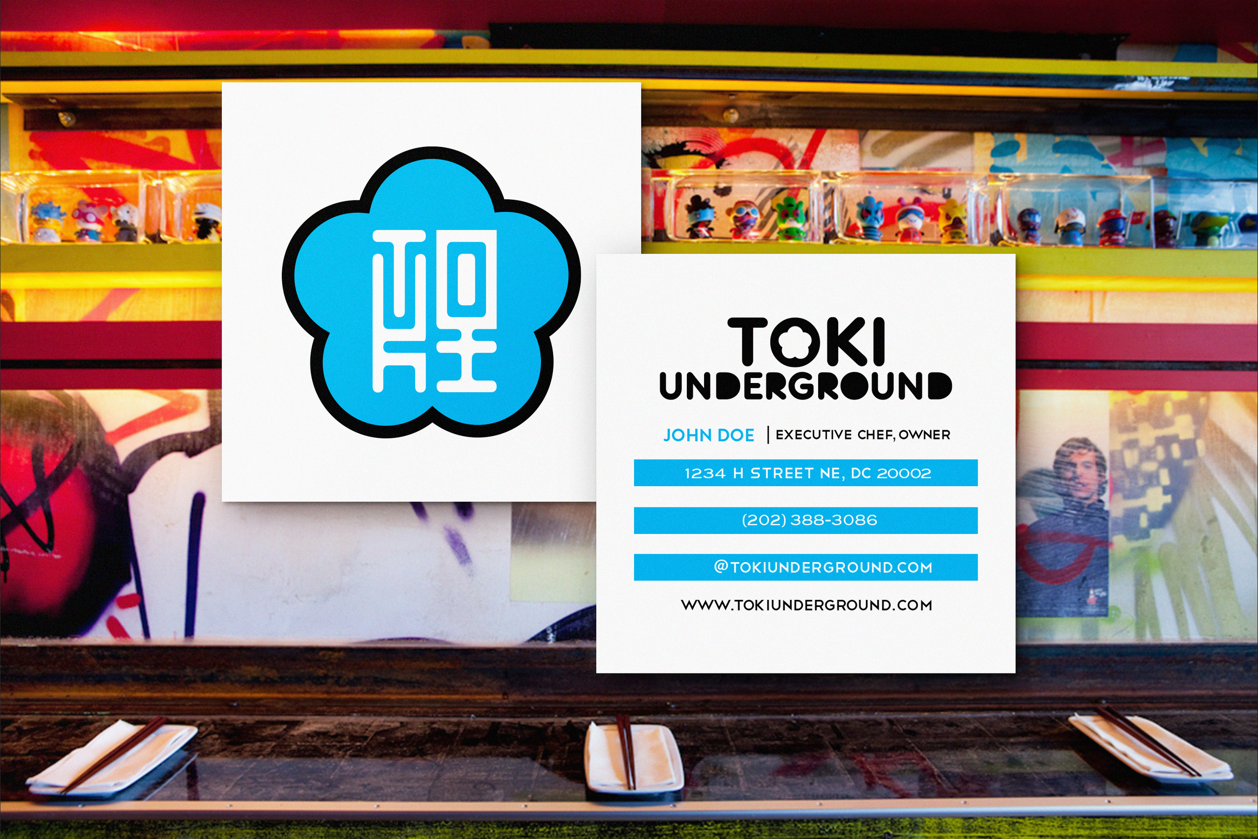
I created the Toki logo drawing inspiration from the iconic flower shape found on the flag of Taipei, paying tribute to the original chef/owner’s birthplace. The shape was reinterpreted into a bold, contemporary mark that bridges Taiwanese heritage with a modern urban restaurant experience with bold and exciting colors.
At the center of the emblem, I hand-lettered “T O K I,” resembling a traditional East Asian character. This creates a visual puzzle that reveals itself gradually. From a distance, viewers perceive a single symbolic mark. Up close, the restaurant’s name emerges from within the form. Some people look at it for a few minutes and then proclaim, “Ohhhhhhh!”
The flower shape surrounding the lettering serves as both a tribute and a frame. It symbolizes heritage, community, and gathering, while the contained monogram gives the logo the feeling of a seal mark, similar to the personal stamps traditionally used throughout East Asia.
One of the most gratifying outcomes of my logo design has been seeing friends/employees love the restaurant so much that they’ve gotten it tattooed on themselves.

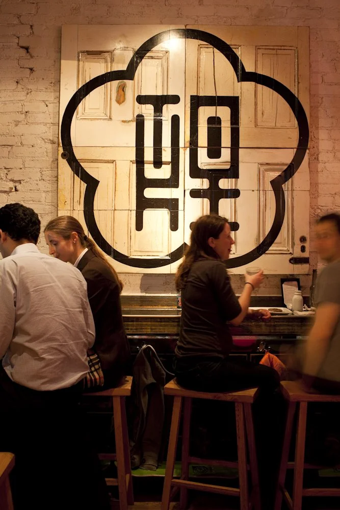
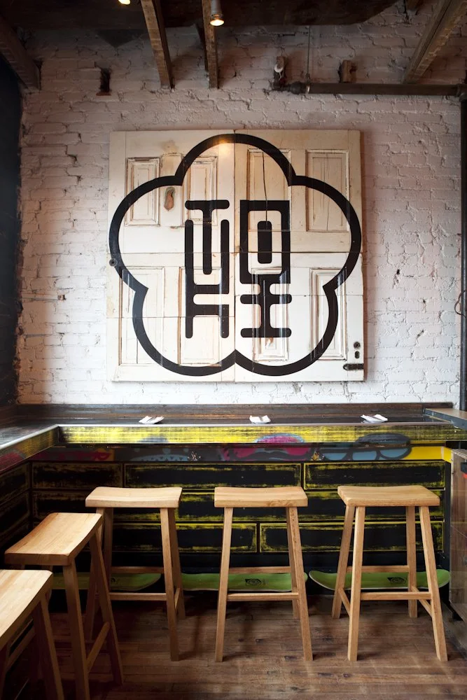
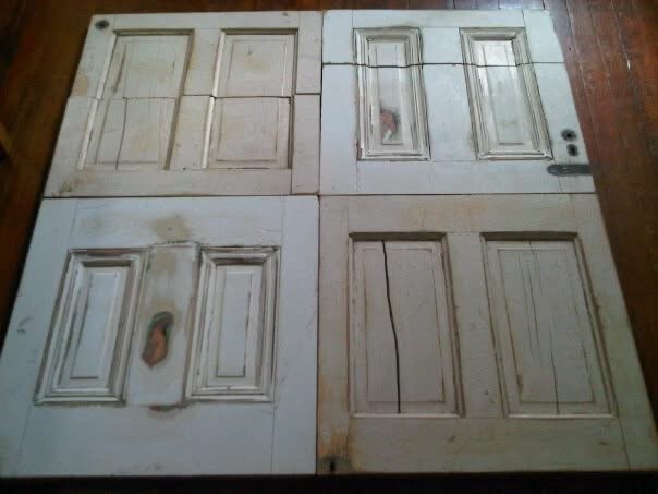
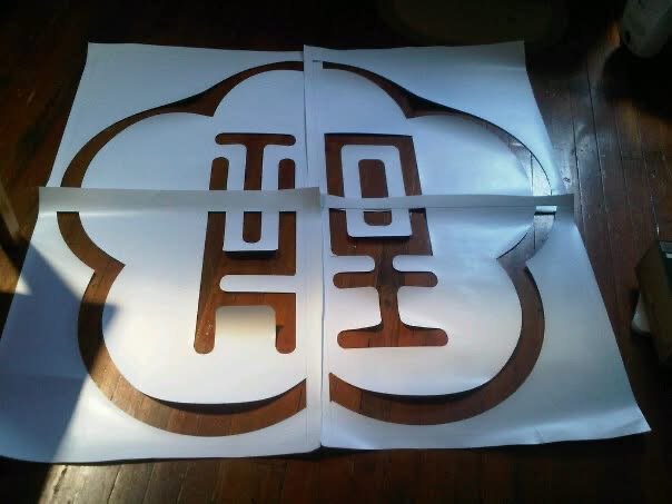
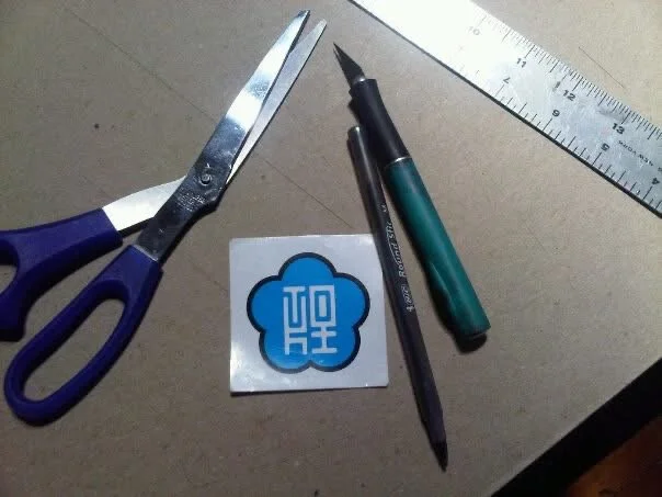
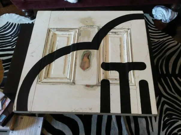
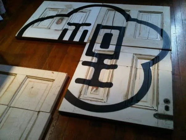
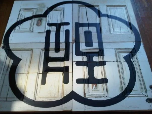
BTS - TOKI DOOR ART
For a dining room art installation, I wanted to showcase the logo in a way that felt unexpected and true to the restaurant’s scrappy beginnings.
Rather than using a traditional canvas, I sourced a pair of salvaged doors from a local architectural reuse center and worked with our contractor to sand and cut them into six sections. I then reassembled the pieces into a 5’×5’ panel and hand-painted the logo using a custom stencil.
Watching the fragmented pieces come back together revealed something larger than the artwork itself. The finished installation reflected the spirit of the restaurant: built from humble materials, assembled with intention, and transformed into something entirely new. To this day, it remains one of my favorite pieces I created for TOKI.

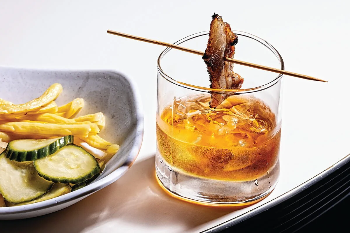
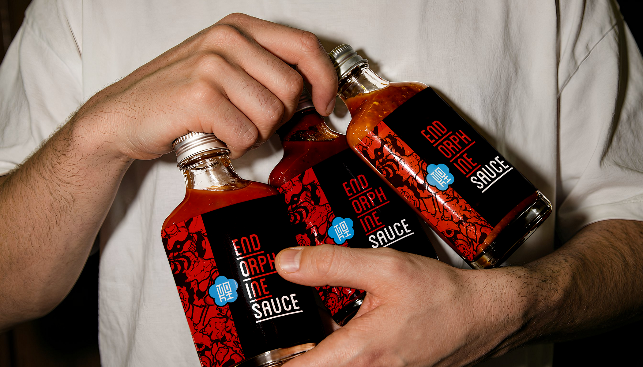
TOKI HOMEMADE ENDORPHINE SAUCE
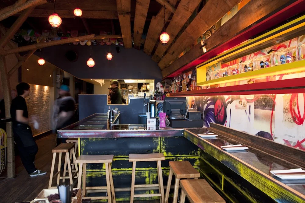
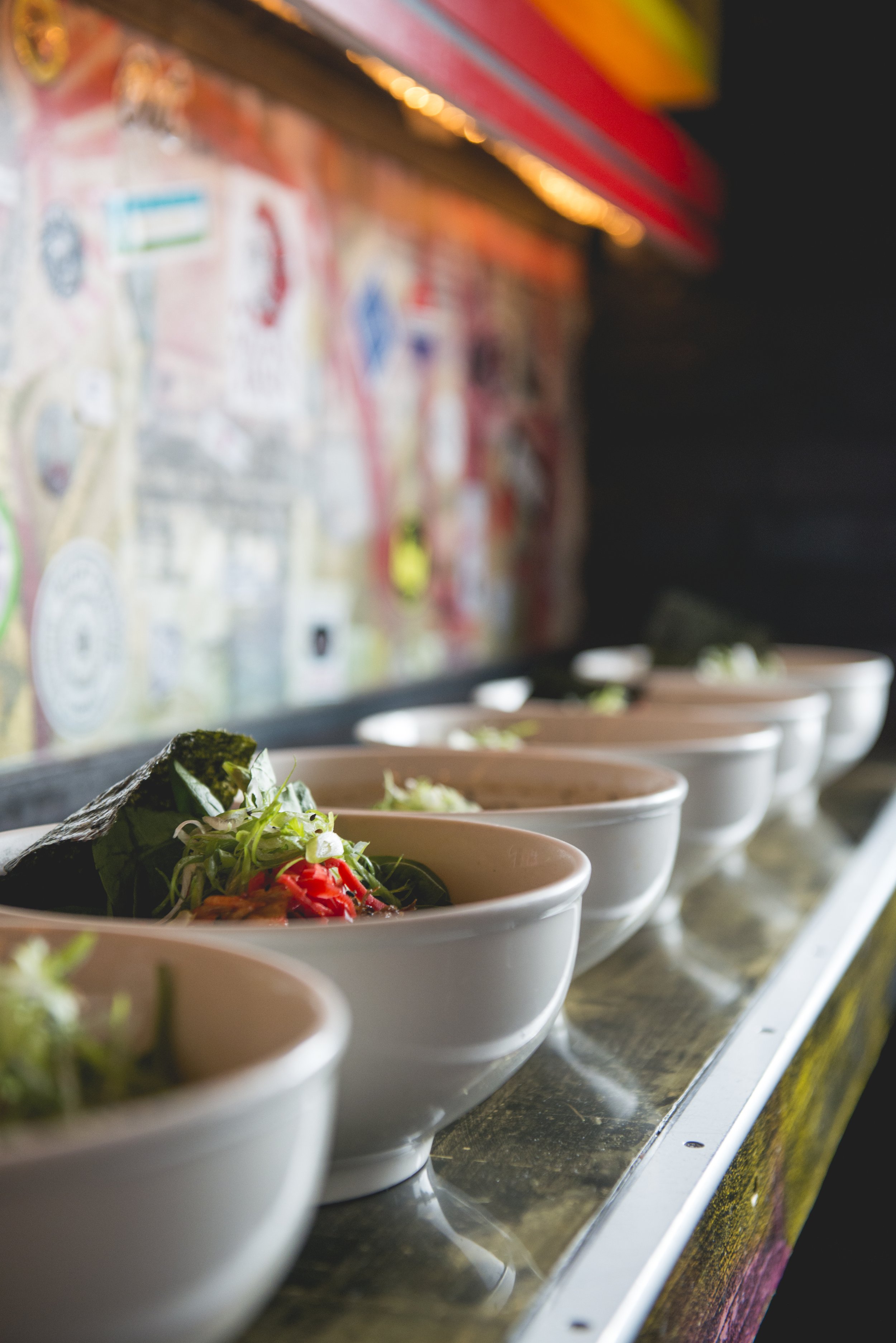
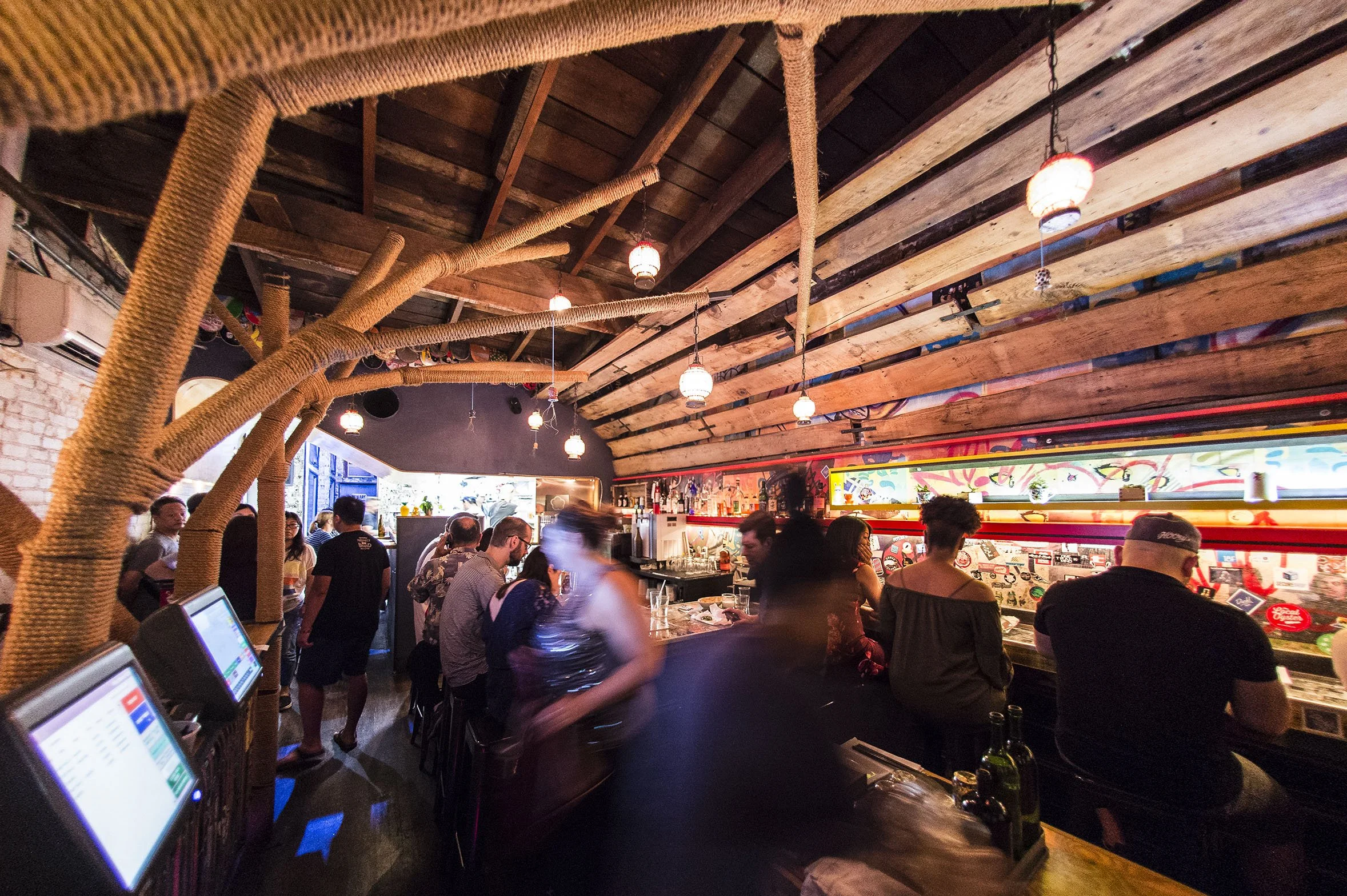
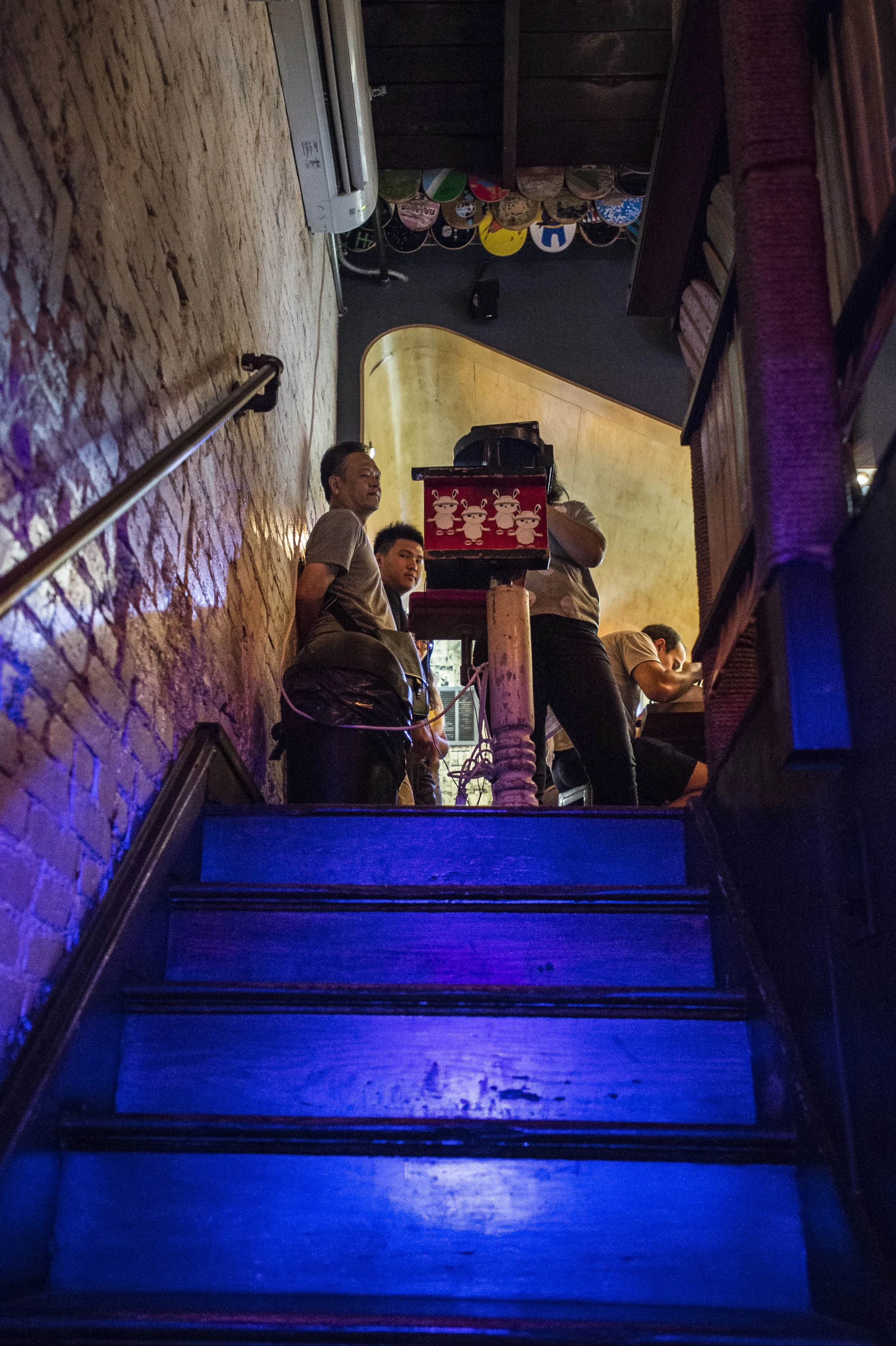
The interior of Toki was designed to feel less like a restaurant and more like a hidden discovery. Inspired by the underground skate, art, and street cultures of Taipei, we transformed an overlooked attic into a space layered with found objects, local artwork, graffiti, and custom installations.
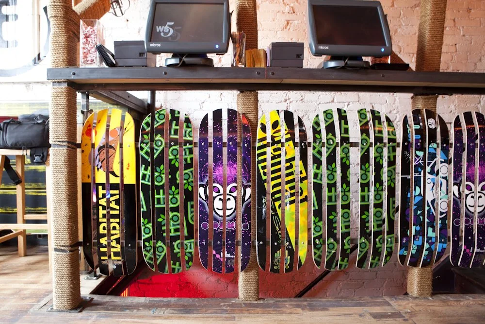
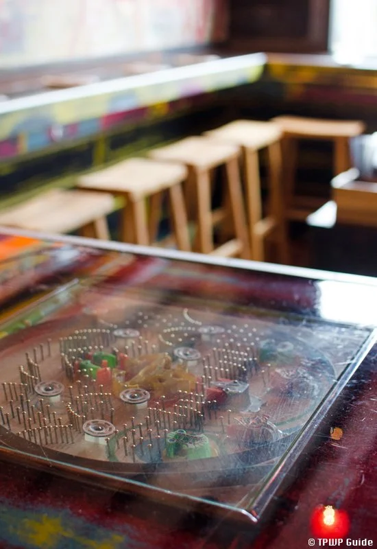
Skateboard motifs appear throughout the restaurant, a nod to one of the owners’ roots in the skateboarding community. Donated decks were repurposed into large-scale art installations and architectural elements, bringing color, texture, and personality into the space. Vintage Pachinko machines, salvaged materials, and collected artifacts further reinforced the feeling that every corner had a story.
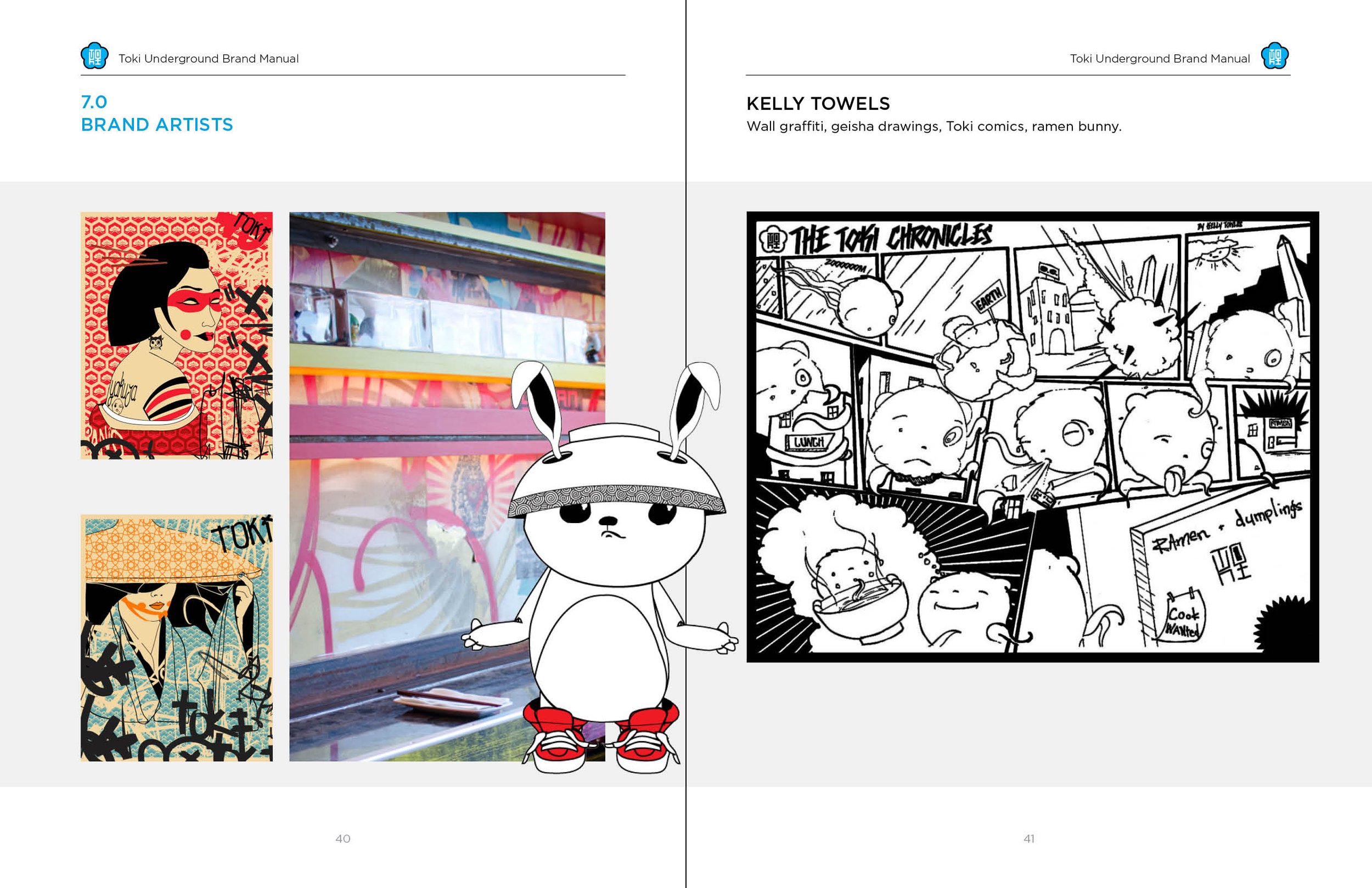
Collaboration with local DC artists played a major role in shaping the restaurant’s identity. Artist Kelly Towles created the graffiti installations throughout the dining room, Geisha women portraits, a “Toki Bunny” cartoon character as well as unreleased sketches of a comic series called The Toki Chronicles. Takashi Nakajima hand-illustrated the immersive black-and-white mural that wraps the bathroom walls. Together, these contributions helped create an environment that felt raw, creative, and distinctly personal, more like an underground gallery than a traditional restaurant.


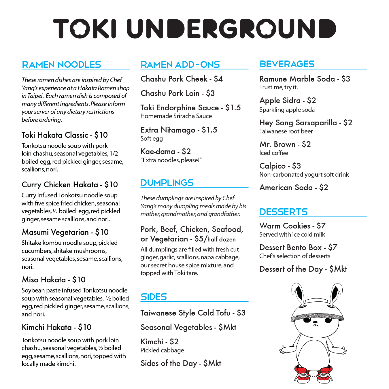
CIRCULAR MENU
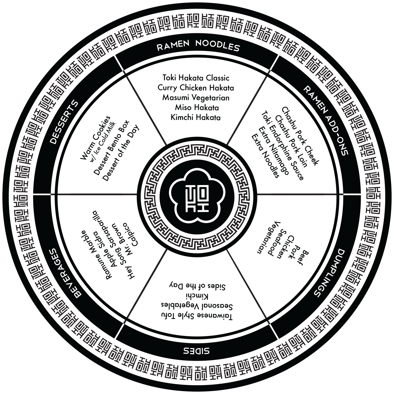
With only six menu categories to organize, I saw an opportunity to rethink the traditional restaurant menu. Rather than relying on a standard rectangular layout, I designed the front of the menu as a circle, dividing each section into its own wedge. Guests had to physically rotate the menu as they explored their options, creating a small moment of interaction and discovery before ordering.
The circular form was inspired by traditional Chinese porcelain plates, particularly the decorative borders often found around their edges. Reinterpreting that detail through the brand, I created a custom repeating pattern using the logo mark and wrapped it around the perimeter of the menu. The result was a piece that felt both familiar and contemporary, blending cultural references with a playful dining experience. In case the circular was too difficult to read, I repeated the menu items traditionally in a 3-column format on the backside.
By turning a functional object into something unexpected, the menu became another opportunity to reinforce the restaurant’s identity and encourage guests to engage with the brand in a memorable way.